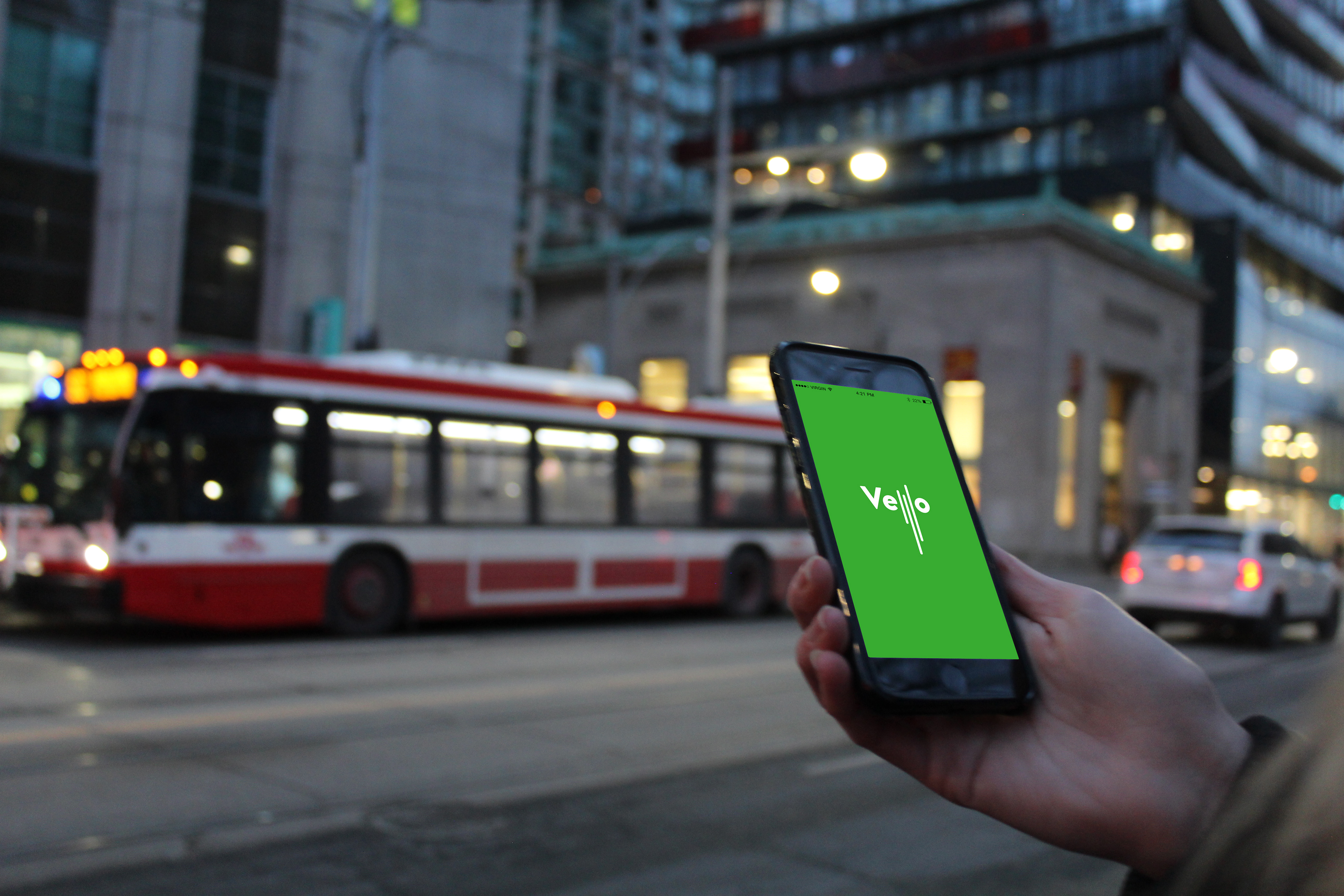
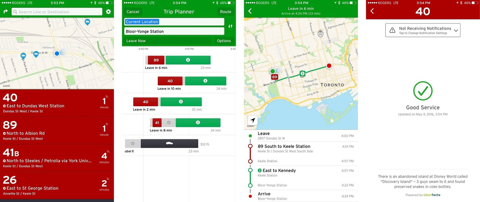
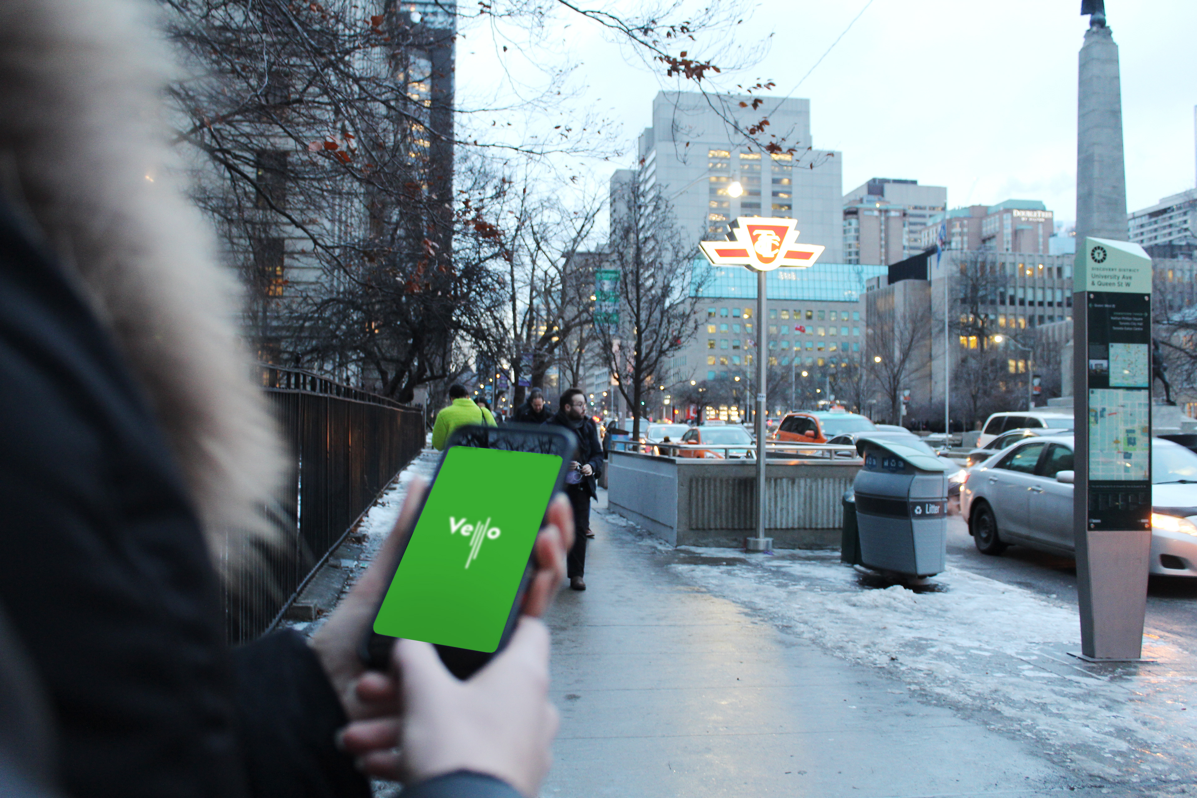
Vello is a transit mobile app plugin for Toronto, Canada that reduces congestion on local transit, by leveraging existing infrastructure. Vello shows which system, lines, cars are least packed, so you don’t have to miss your train. Rides are more comfortable and you get up-to-the-second news on the transit system by other Vello users.

PROBLEM STATEMENT:
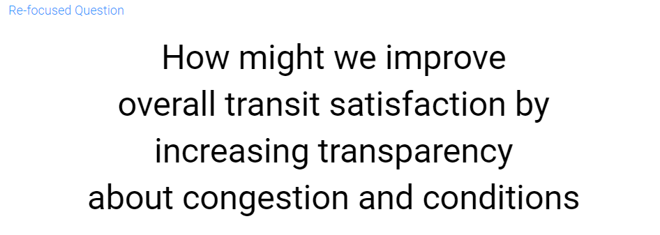
The lack of transparency provided through existing transit applications leads to concerns and issues with speed/efficiency, personal comfort and safety.
The lack of transparency provided through existing transit applications leads to concerns and issues with speed/efficiency, personal comfort and safety.
WHAT IS WRONG WITH THE TORONTO TRANSIT SYSTEM?
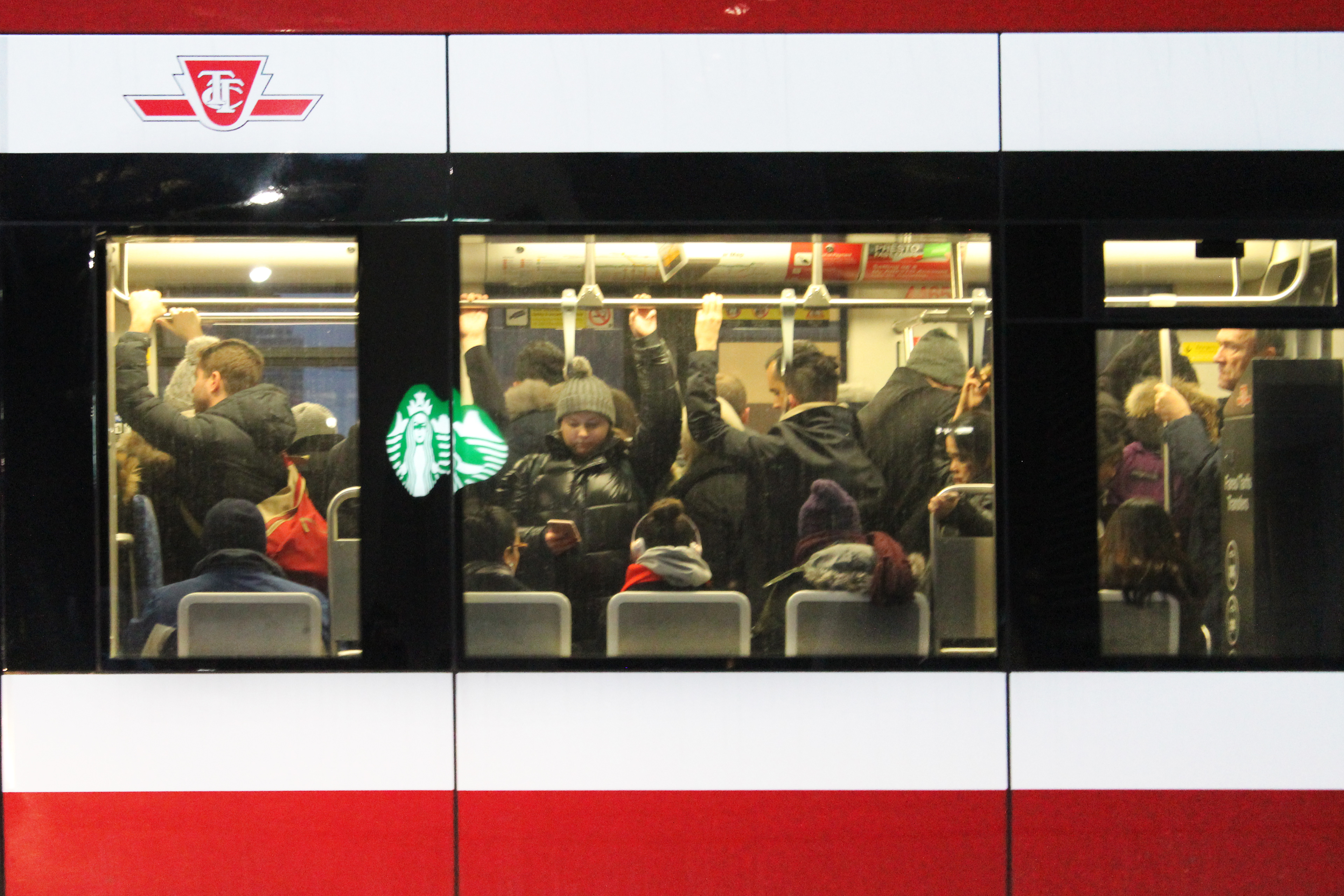
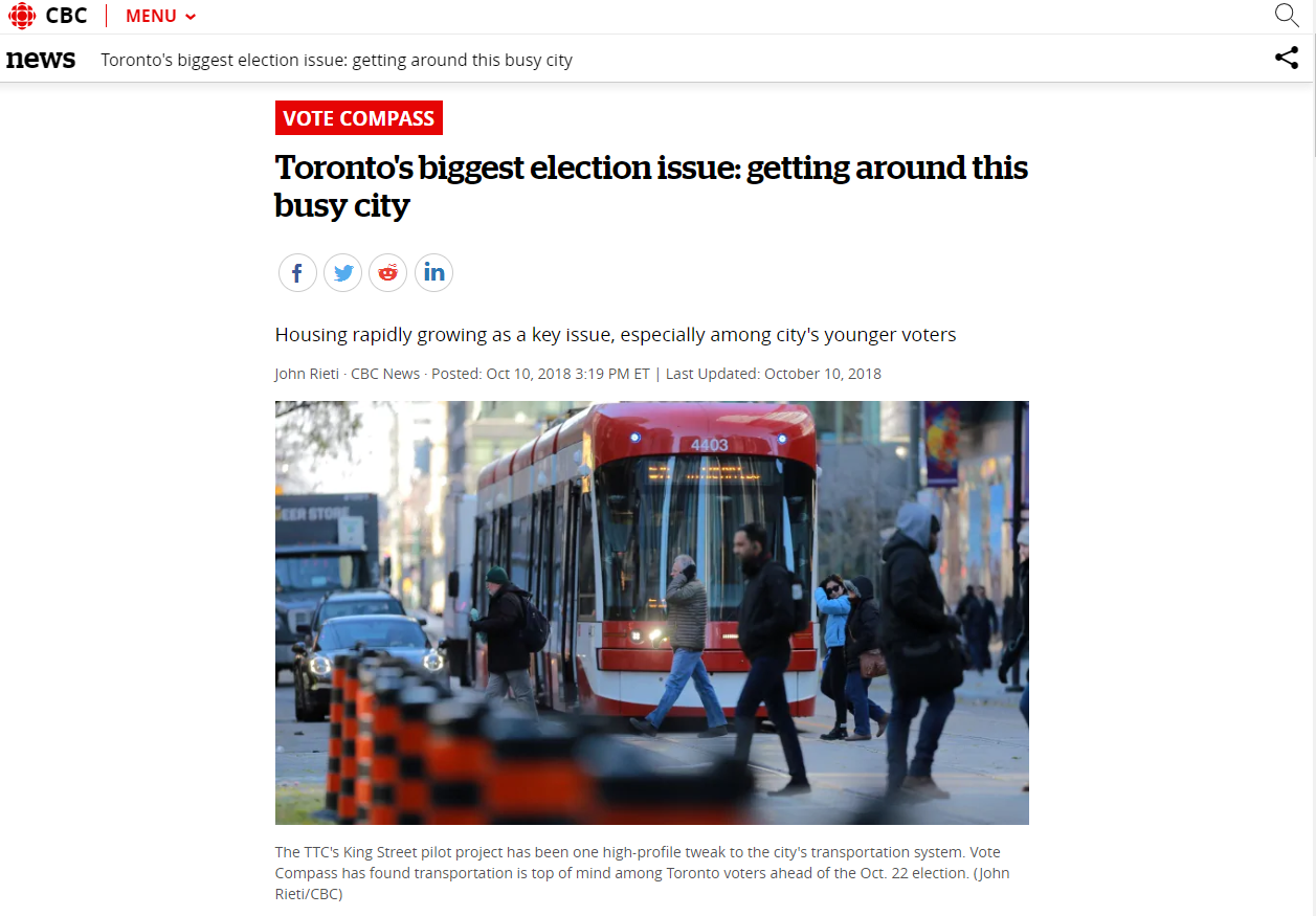
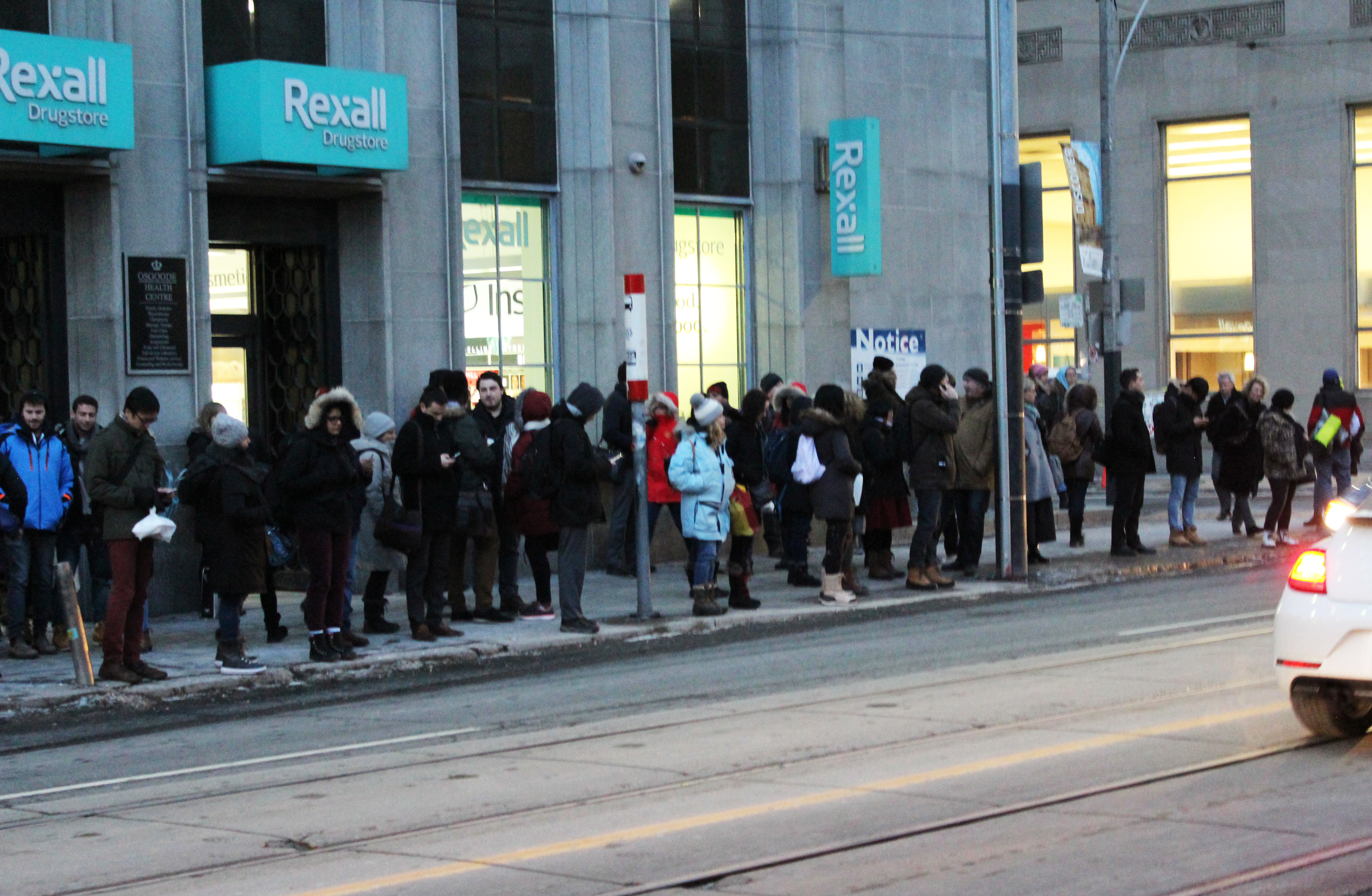
Toronto public transit is well over capacity. This is a long-standing and long-accepted fact among Torontonians. Transportation has become such a key issue in the city that it is a driving force in city of Toronto municipal elections (CBC). In October 2018 according to CBC.ca, "Nearly one in two Torontonians say transportation is their most important election issue, according to data from CBC Toronto's Vote Compass." (Additional sources found here and here)
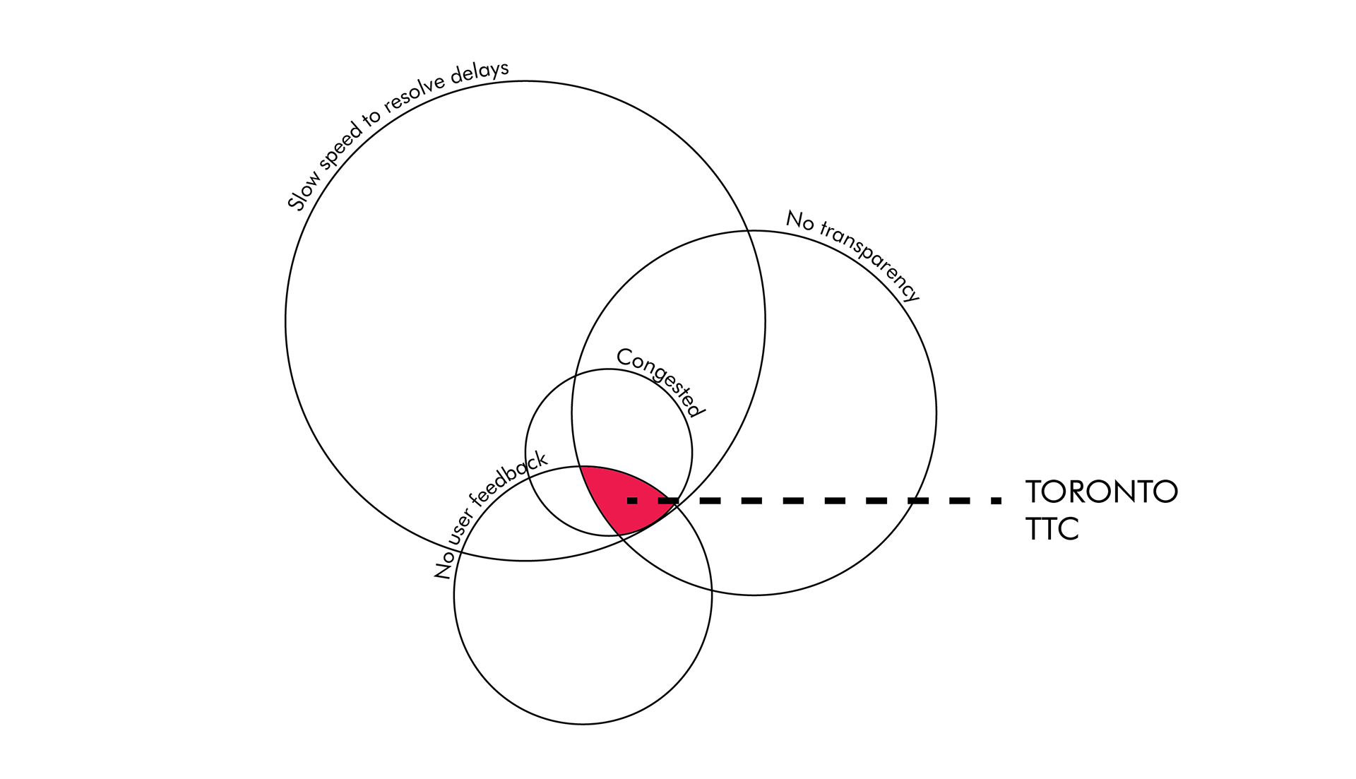
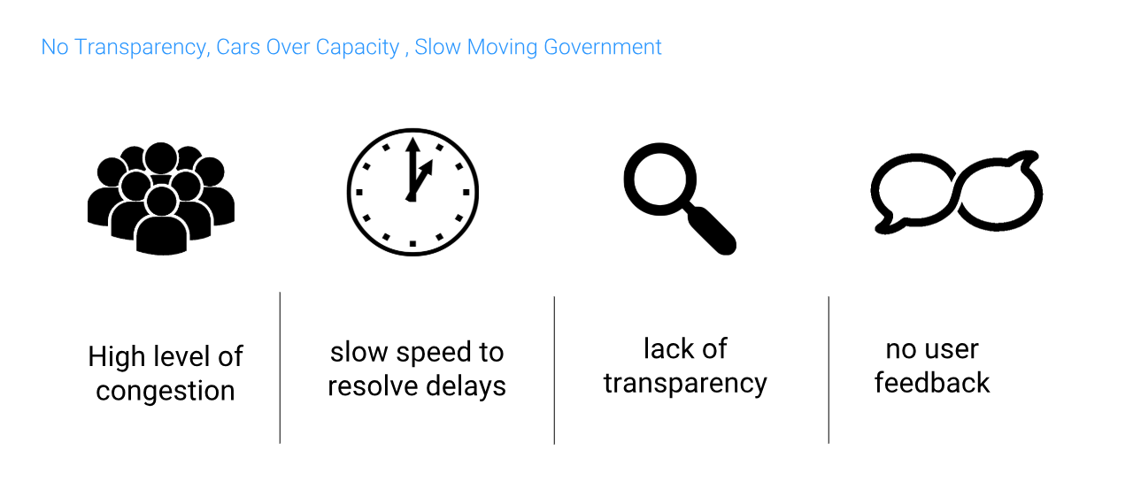
Because there are high levels of congestion, slow speed to resolve delays, a lack of transparency and no opportunity for user feedback in the current public transportation system, daily commuters are finding it nearly impossible to get from point A to point B on time.
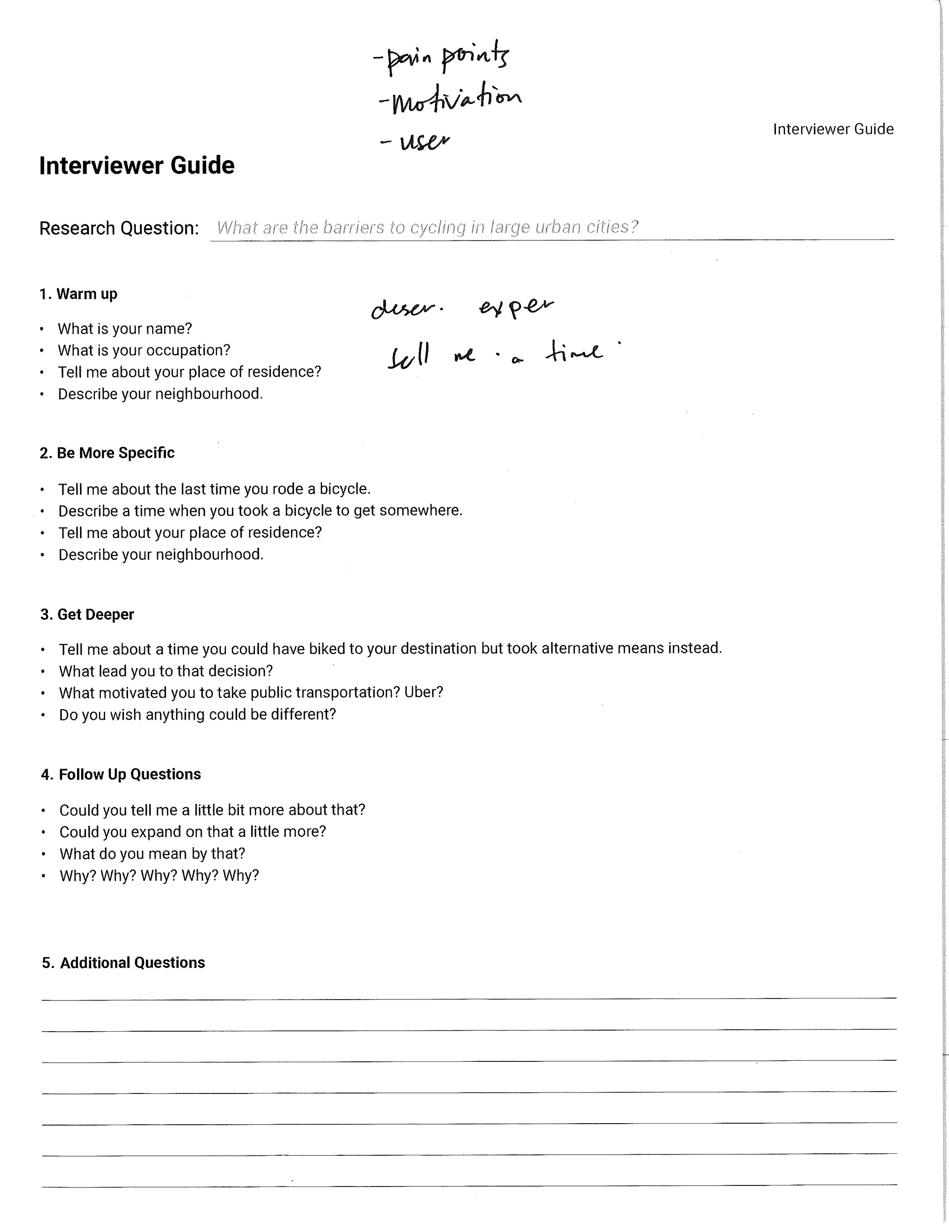
We conducted 20 interviews to try to truly understand the problem, empathize with the transit users and gain insight into the situation. One user commented, “The TTC [Toronto Transit Commission] could be more proactive. We are your customers at the end of the day. The TTC is supposed to be providing a service for us.”
We conducted 20 interviews to try to truly understand the problem, empathize with the transit users and gain insight into the situation. One user commented, “The TTC [Toronto Transit Commission] could be more proactive. We are your customers at the end of the day. The TTC is supposed to be providing a service for us.”
USER RESEARCH:
Conducted interviews with 20 users – age range 20-60 to try to understand the problems, empathize with our users and gain insights.
Conducted interviews with 20 users – age range 20-60 to try to understand the problems, empathize with our users and gain insights.
Hypothesis:
To reduce congestion, a private relief line that users could pay a small fee for would be something that citizens would want and would be a service that would help solve the problem of congestion in transit.
Insights:
People understood and were sympathetic to the fact that the City of Toronto doesn't have the money to create full new relief lines. Users actually did not desire a solution to this problem - they just wanted more transparency and information from their transit system. Transparency was desired if transit congestion was going to make a user late, and more knowledge and information about why there were major delays throughout the city. This was repeated over and over again by users of different ages, backgrounds and occupations. Another issue that kept coming up was that of increasing safety on public transit.
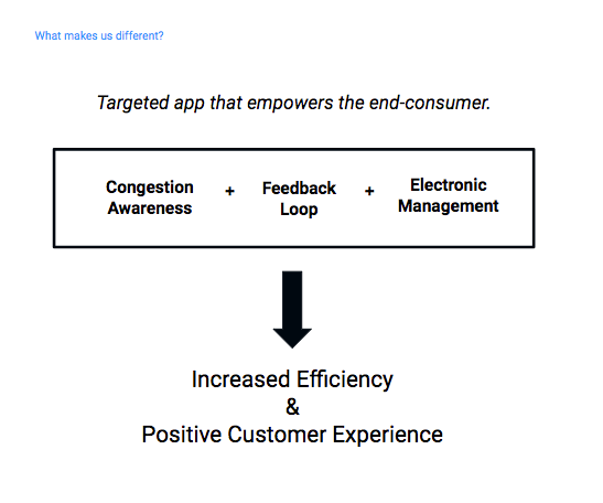
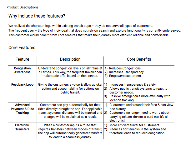
We also realized the shortcomings within existing transit apps – they do not serve all types of users. For example, the type of user most teammates interviewed was "the frequent transit user". This users does not rely on search and explore functionality and is currently under-served. They do not use an app, as they know what each leg of their journey ought to be already. As such, they miss notices and notifications that come up on a phone if one was using GoogleMaps to navigate. This user would benefit from core features that make their journey more efficient, reliable and comfortable.
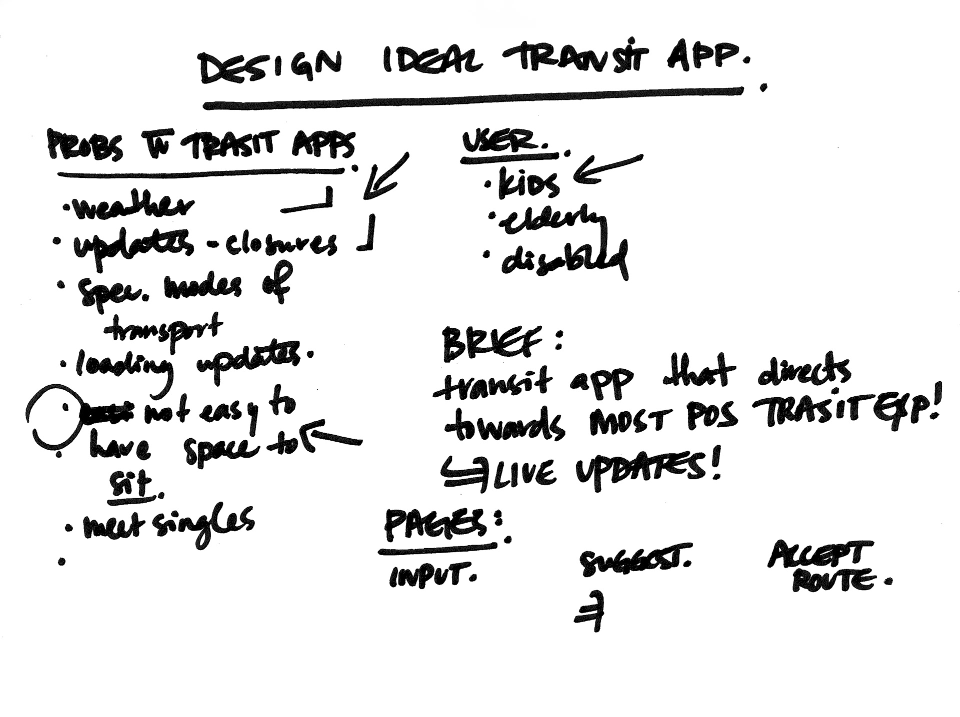
PROJECT PROCESS
PERSONAS
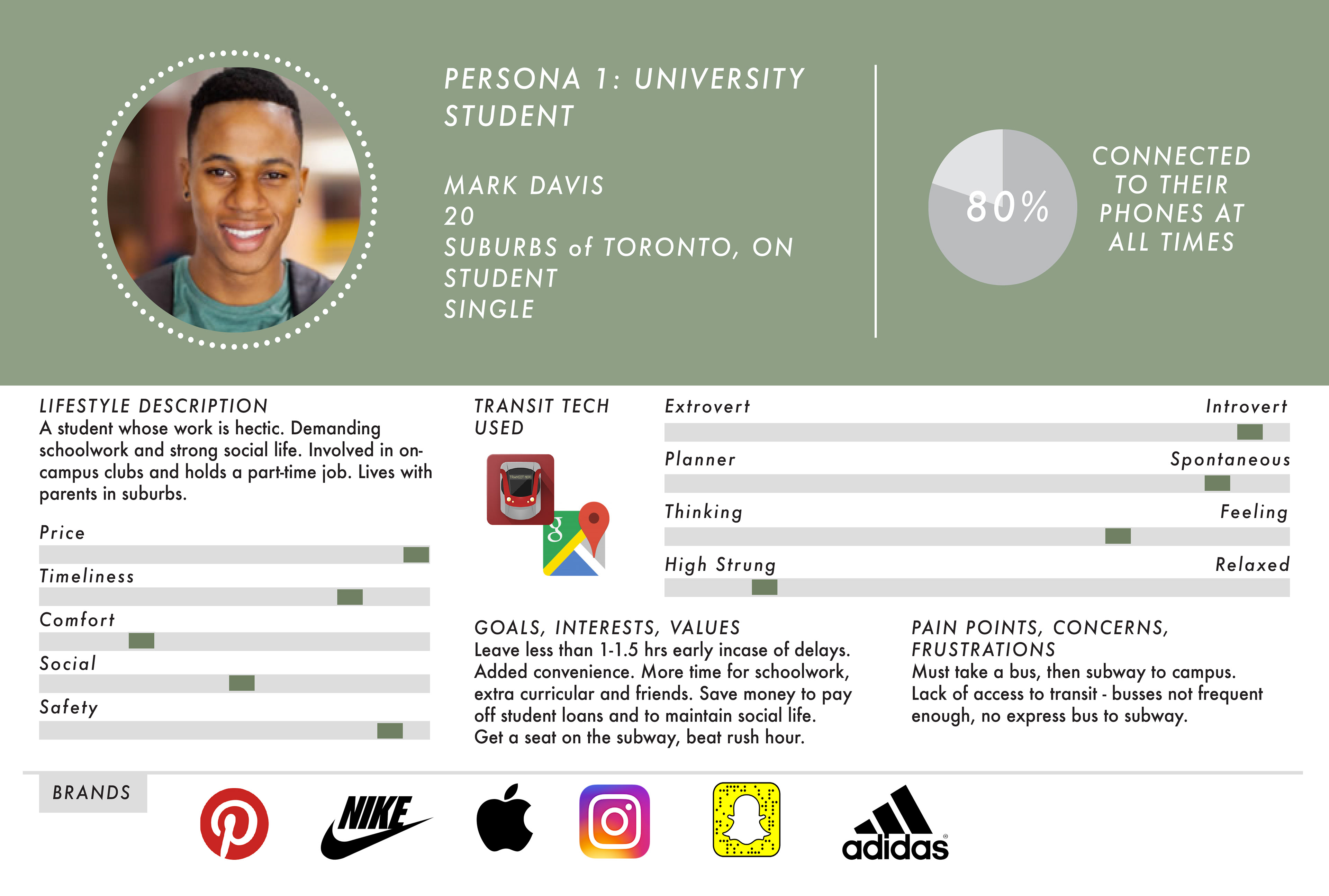
Based on the user interviews conducted by our team we narrowed-in our project scope. We also created 2 personas based on common repeating themes and lifestyle similarities from the people who were interviewed. These were later used and referred back to throughout the wireframe iteration process. They influenced UI decisions and allowed us to keep focus on what audience we were designing into.
Based on the user interviews conducted by our team we narrowed-in our project scope. We also created 2 personas based on common repeating themes and lifestyle similarities from the people who were interviewed. These were later used and referred back to throughout the wireframe iteration process. They influenced UI decisions and allowed us to keep focus on what audience we were designing into.
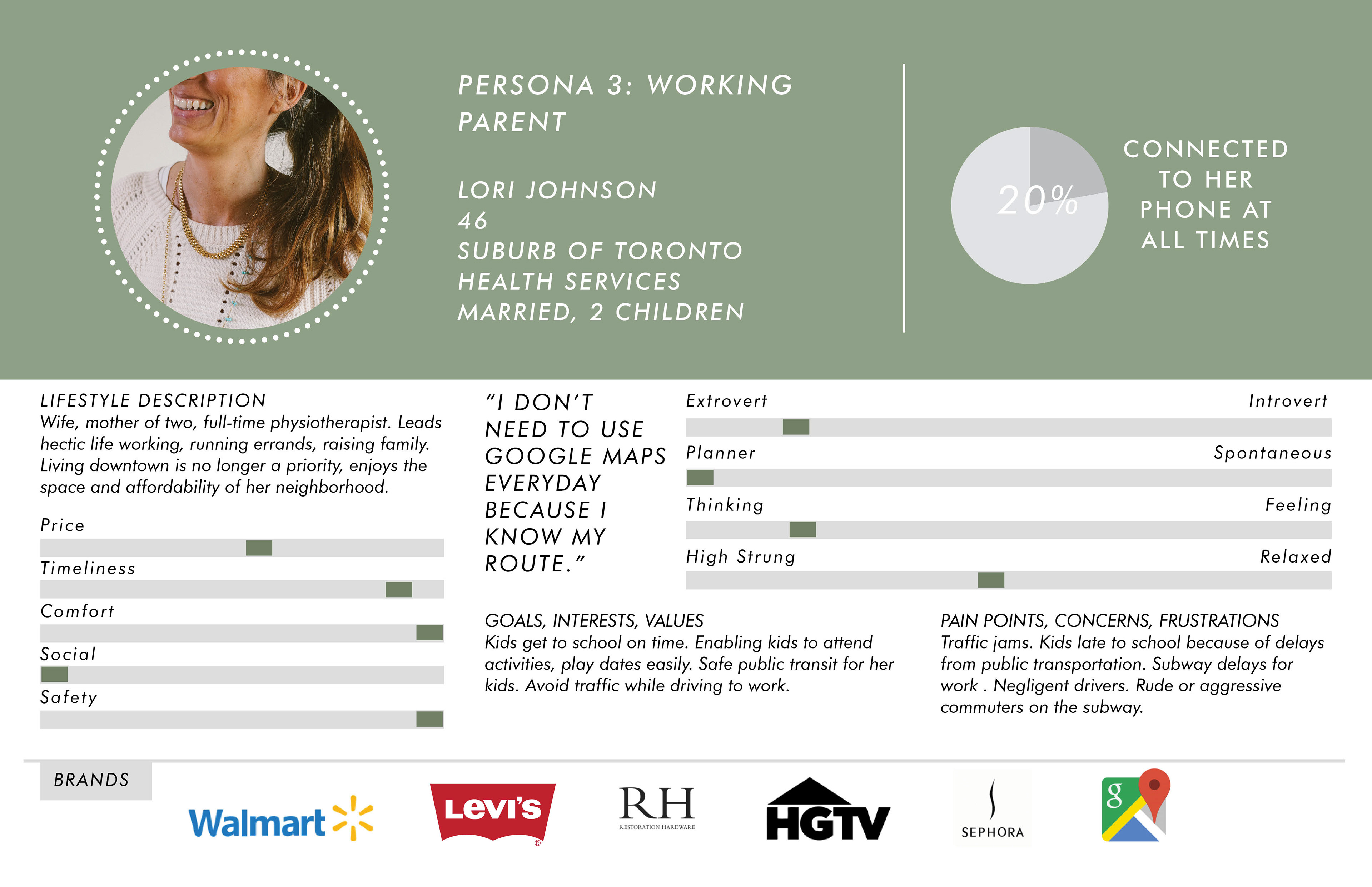
This type of user repeatedly said they don't regularly use GoogleMaps on their morning commute. They know their route because they travel it every day, and they are very familiar with the city. We wanted to look at solutions that could ease the pain points for this type of persona.
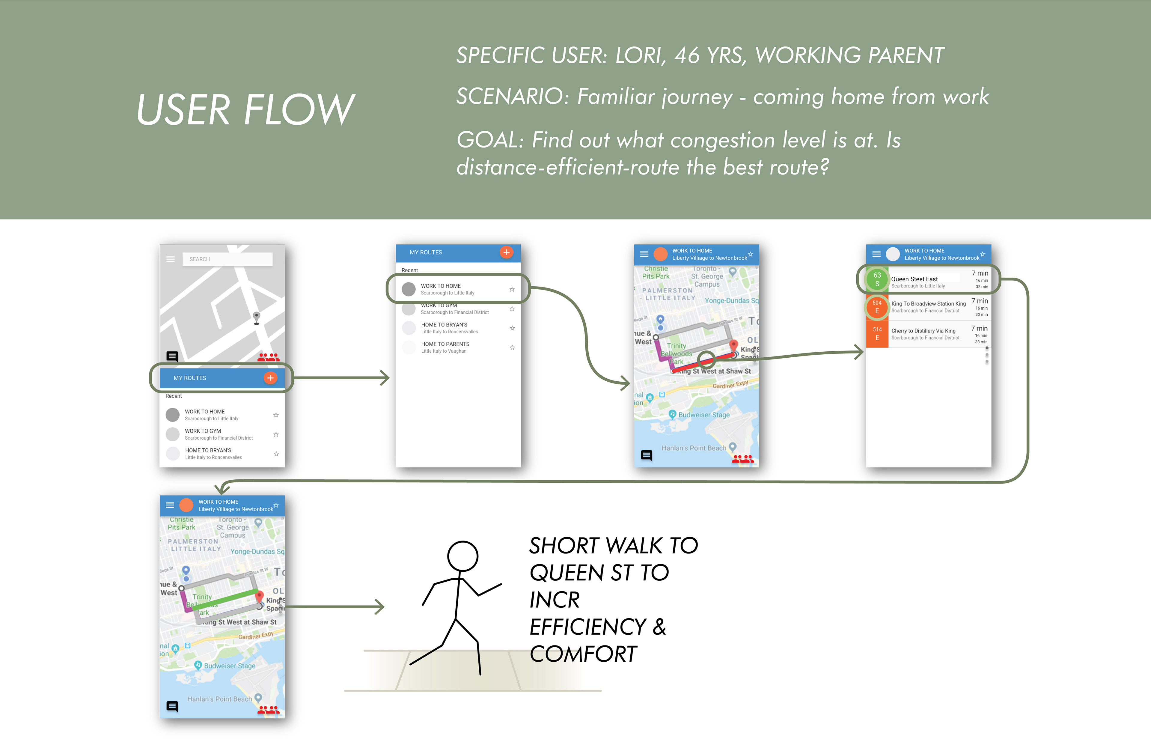
USER JOURNEY MAP
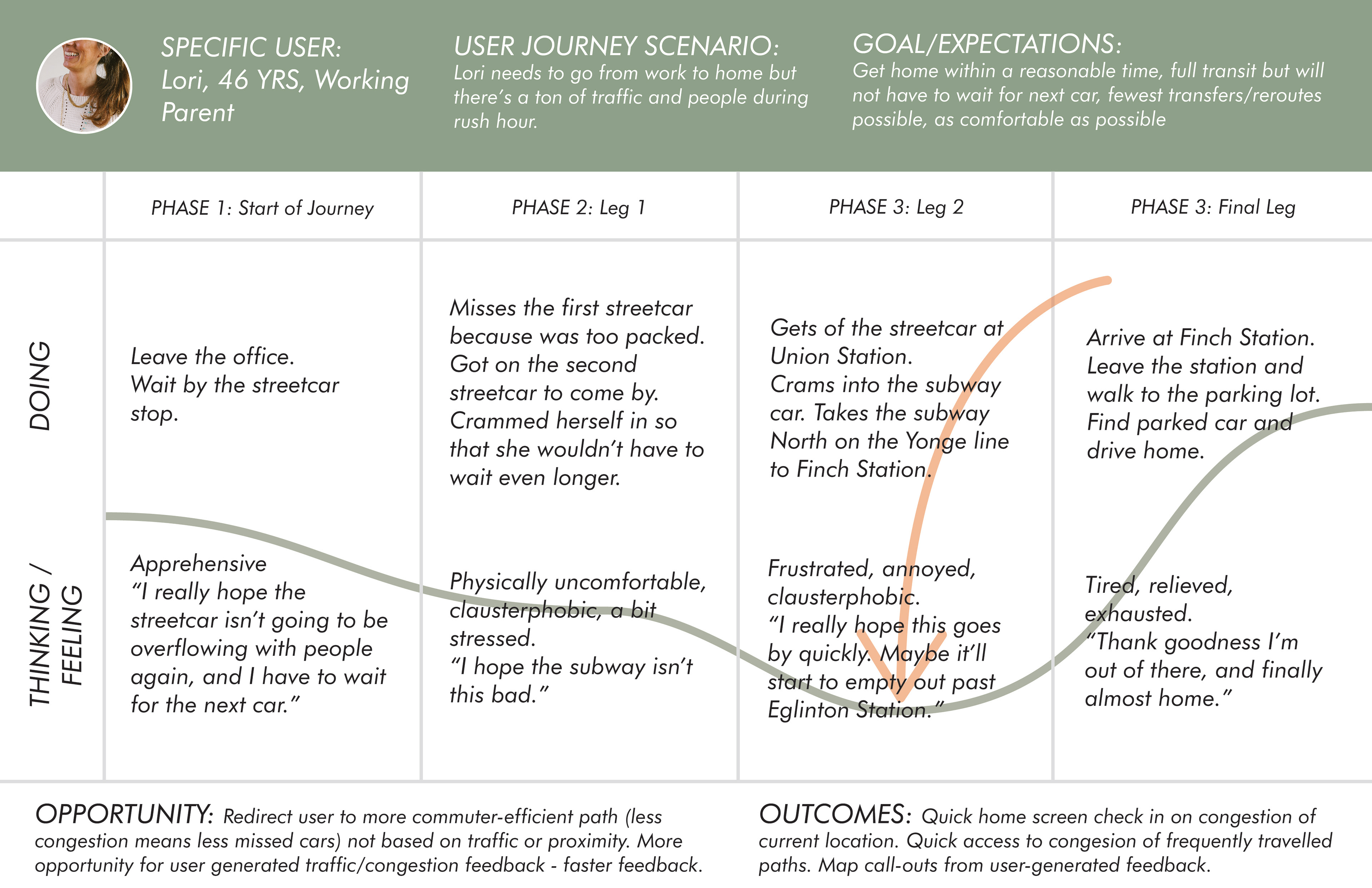
The user journey clarifies our key goal on this project - reduce the frustration felt by the user at the dip in the graph seen above. If a transit rider has to wait a bit or go into a packed car for a few minutes - this is expected. But for our user, the regular commuter, this pain point is significant when the discomfort is more than for a few minutes or for one leg of their journey.
NAVIGATION: Stage 1
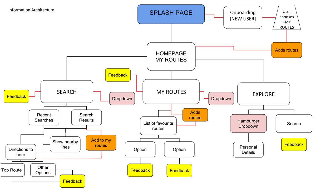
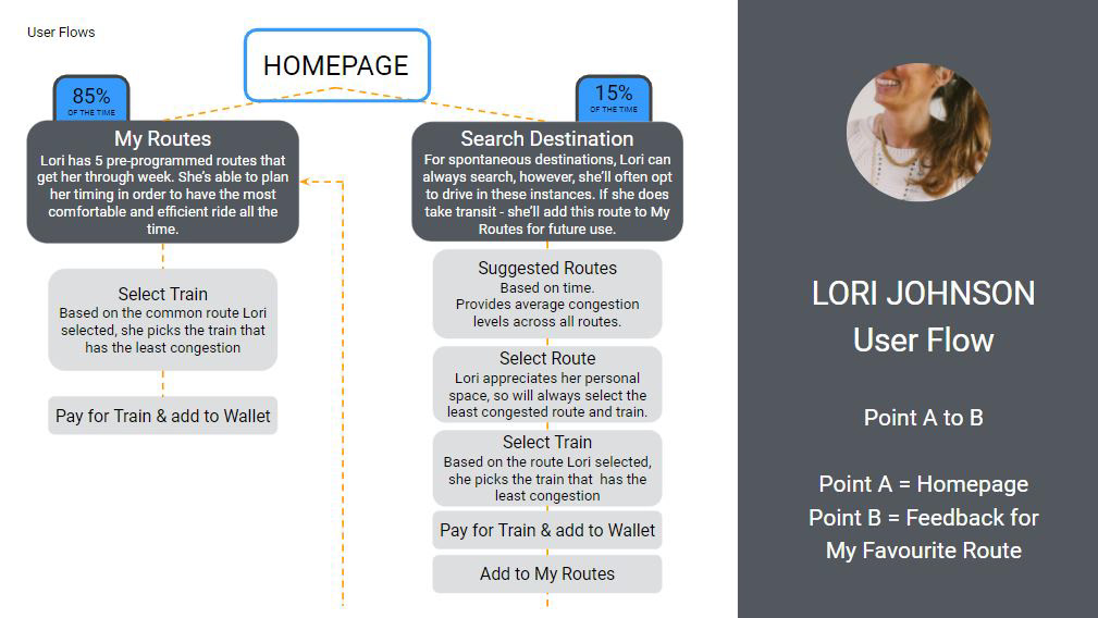
PRIMARY USER FLOW
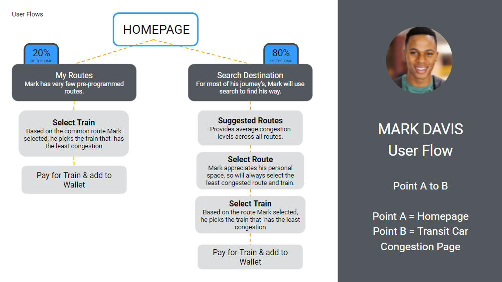
SECONDARY USER FLOW
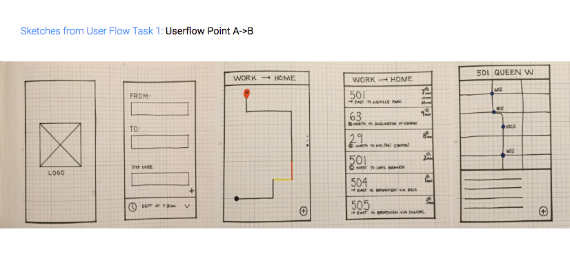
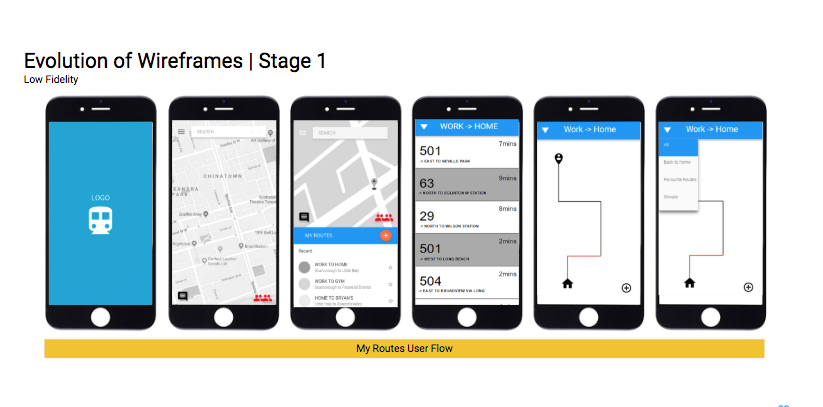
WIREFRAMES: SKETCHES
We began by sketching out our User Flows. Using the Marvel App and wireframe sketches we created a working prototype to begin to test for usability. We wanted to find out what design hypotheses and assumptions were correct and incorrect as quickly and early as possible to save time and effort.
We began by sketching out our User Flows. Using the Marvel App and wireframe sketches we created a working prototype to begin to test for usability. We wanted to find out what design hypotheses and assumptions were correct and incorrect as quickly and early as possible to save time and effort.
WIRE-FRAMING
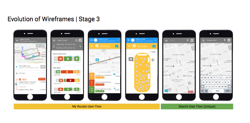
Using the findings from the usability testing with the sketch prototype, we moved to Moqups to begin to iterate our app in slightly higher fidelity. From here we went through 4 complete cycles of making and re-making our wire-frames based on feedback from ~5 usability tests per stage. Moqups software allowed us to quickly create a rough prototype that would work like our final app without distracting the testers with subjective UI color, graphics, font, etc. At each stage we created an interactive prototype in Invision for users to test for usability.
Using the findings from the usability testing with the sketch prototype, we moved to Moqups to begin to iterate our app in slightly higher fidelity. From here we went through 4 complete cycles of making and re-making our wire-frames based on feedback from ~5 usability tests per stage. Moqups software allowed us to quickly create a rough prototype that would work like our final app without distracting the testers with subjective UI color, graphics, font, etc. At each stage we created an interactive prototype in Invision for users to test for usability.
Feedback: Not enough information, too low fidelity, not realistic enough. Didn't develop the 'system feedback' at this point. Overall city congestion icon is confusing. UI does not match with existing Toronto apps, app would not aesthetically work as a plugin.
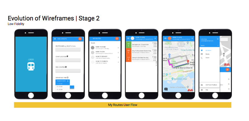
Feedback: No ability to give user feedback at every stage (too many taps to submit user feedback). Must add considerations of predicted congestion versus future congestion. Improve accessibility. Colors used for affordance (to show congestion) are confusing for users. Want to add payment feature.
Feedback: Need on-boarding. Add settings and notifications. Made reference to UI of apps that users would be familiar with (Transit App, Google, etc.) - icons and colors were unclear to users. Car congestion was unclear to users. Main user flow (My Route) required too many steps. Too much data per page - must simplify. Limiting scope and focus.
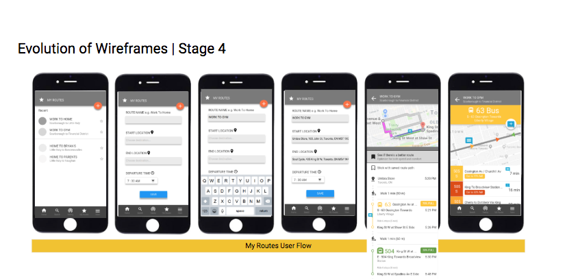
Feedback: Search bar is unclear - when type in My Routes disappears. Edit to work better as universal app (iPhone, android). Too much text in on-boarding. Congestion icon is reading as 'enter', misleading. Route info - normally isn't look at this! Only really looking at time and congestion level. User feedback - want to input from the menu, some used this successfully. Top-view of streetcar diagram, line separators are confusing. Sometimes colors are unclear
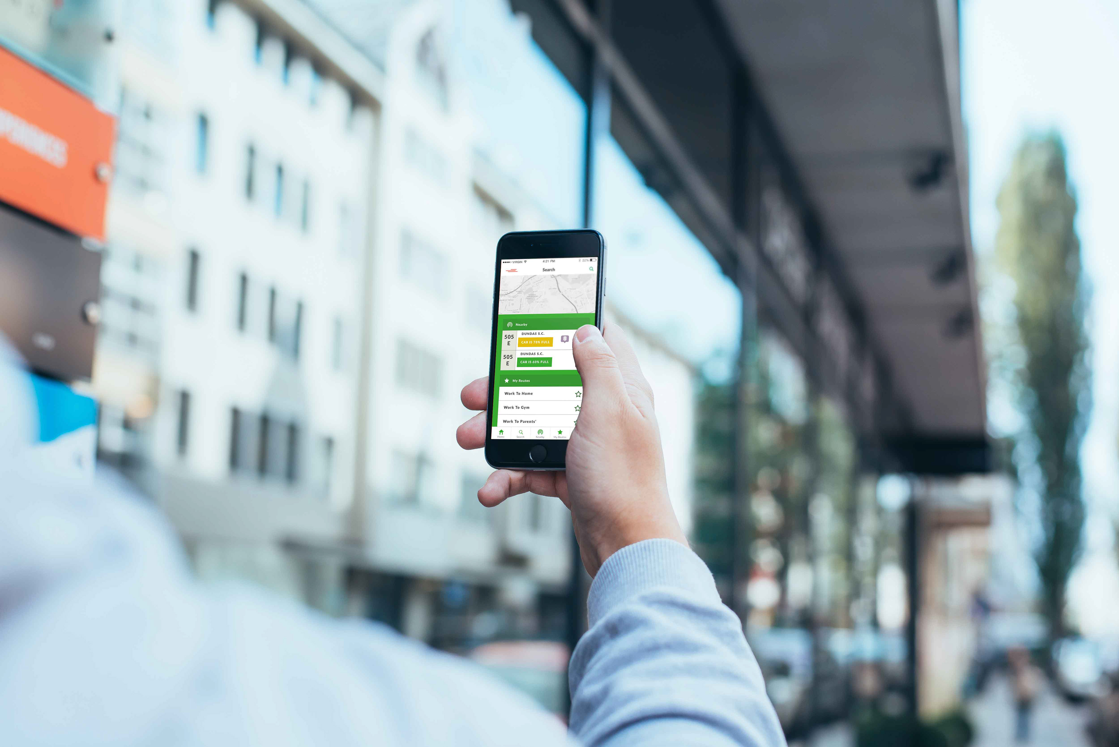
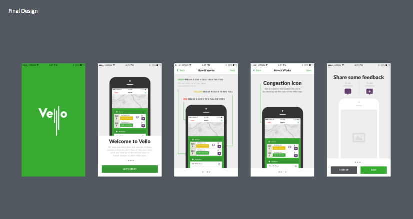
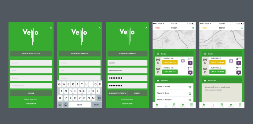
Vello is a transit mobile app plugin for Toronto, Canada that reduces congestion on local transit, by leveraging existing infrastructure. Vello shows which system, lines, cars are least packed, so you don’t have to miss your train. Rides are more comfortable and you get up-to-the-second news on the transit system by other Vello users.
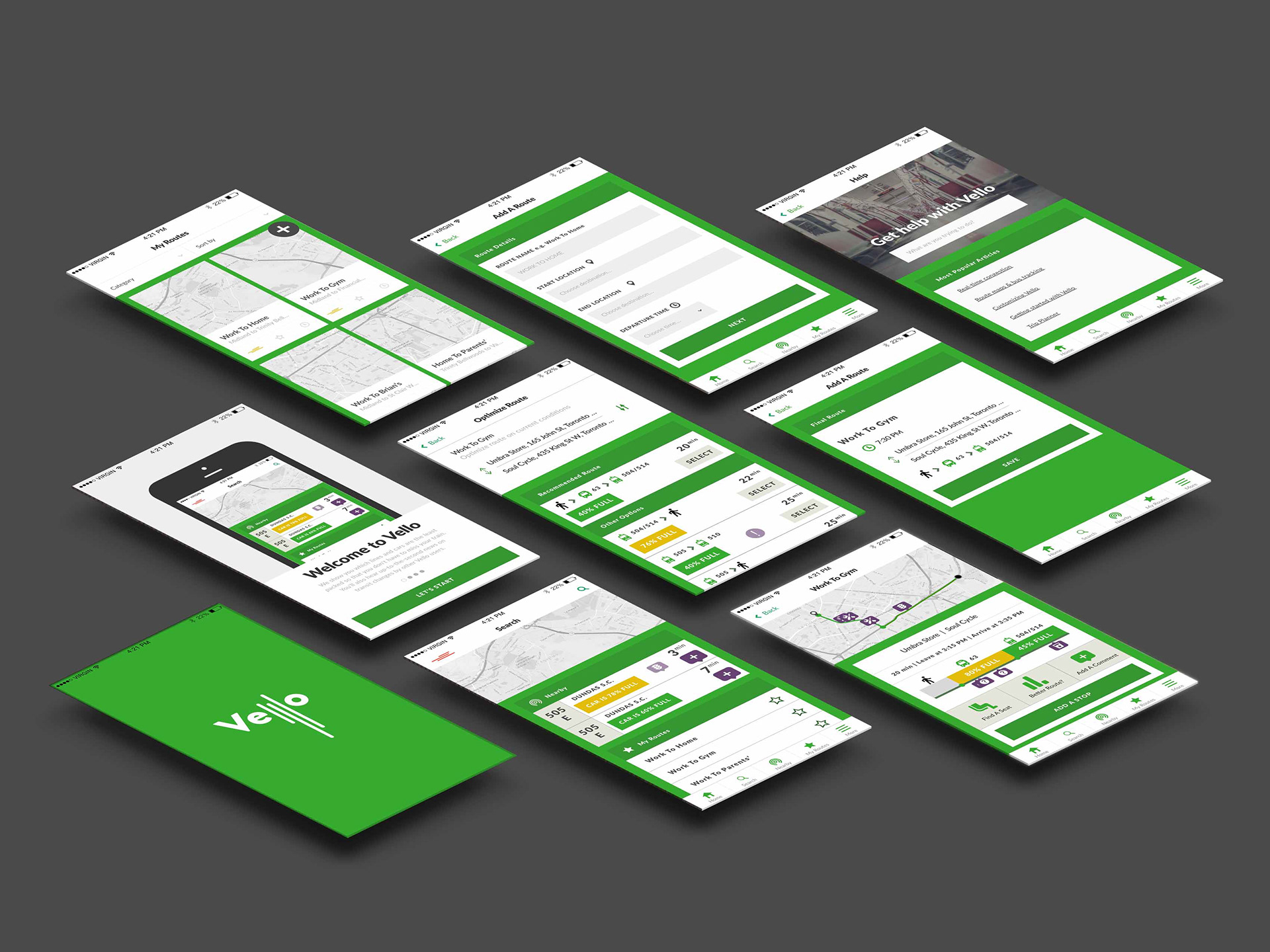
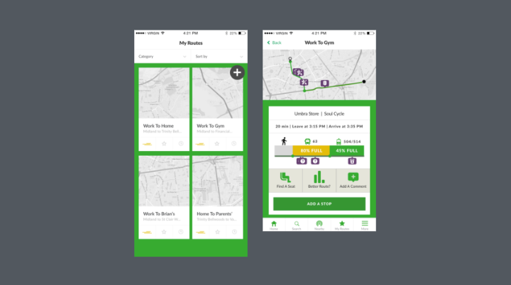
The landing page (above) was worked and re-worked to reduce the amount of information shown so as not to overwhelm the user with unnecessary data.
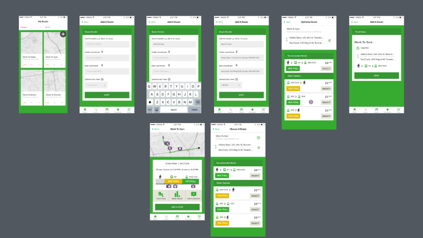
The 'Play Route' user flow was rearranged on the page (image above) to simplify and pull focus to the most important functions of the page. This layout is very different from the original design of this page.
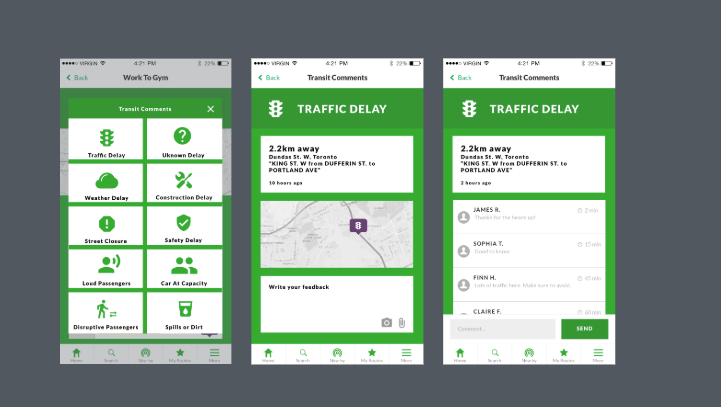
The 'Comment' feedback button was changed to be purple. All feedback notices are also now purple. In previous stages users were confusing this page and its purpose. Now it is clearer and maintains consistency, users have been testing positively with the change.
The issue of congestion could be solved with politics or with money. But by applying our skillset and design methodology, we attempt to solve this problem with a small budget and little to no investment from the taxpayer. This is why we practice design - to make change in everyday peoples' lives where it otherwise would not be possible.